Company
Brand Guidelines & Press Kit
About Pory
Pory is an AI portal builder for small teams that work with people outside them: programs, member organizations and service businesses. Describe who signs in and what each person needs, and Pory builds a branded portal on its own database, with logins, forms, approvals, status tracking and a view for each person that shows only what's theirs. Paid plans are a flat price per portal with unlimited users.
Pory was founded in 2020 by Samantha Wong and Luannie Dang in Melbourne, Australia. Press inquiries: support@pory.io.
Logo
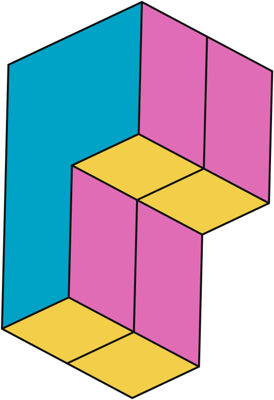
Our logo is the keystone of Pory's brand identity. Just as portals on Pory are built from blocks, the letter P is built from blocks too. That makes the logo instantly recognizable and easy to connect with what Pory does.
Colors
Our core brand palette is playful and vibrant, with an added jolt of creativity. We want to create an unmistakable, identifiable and ownable signature for brand recognition.
Logo Lockup
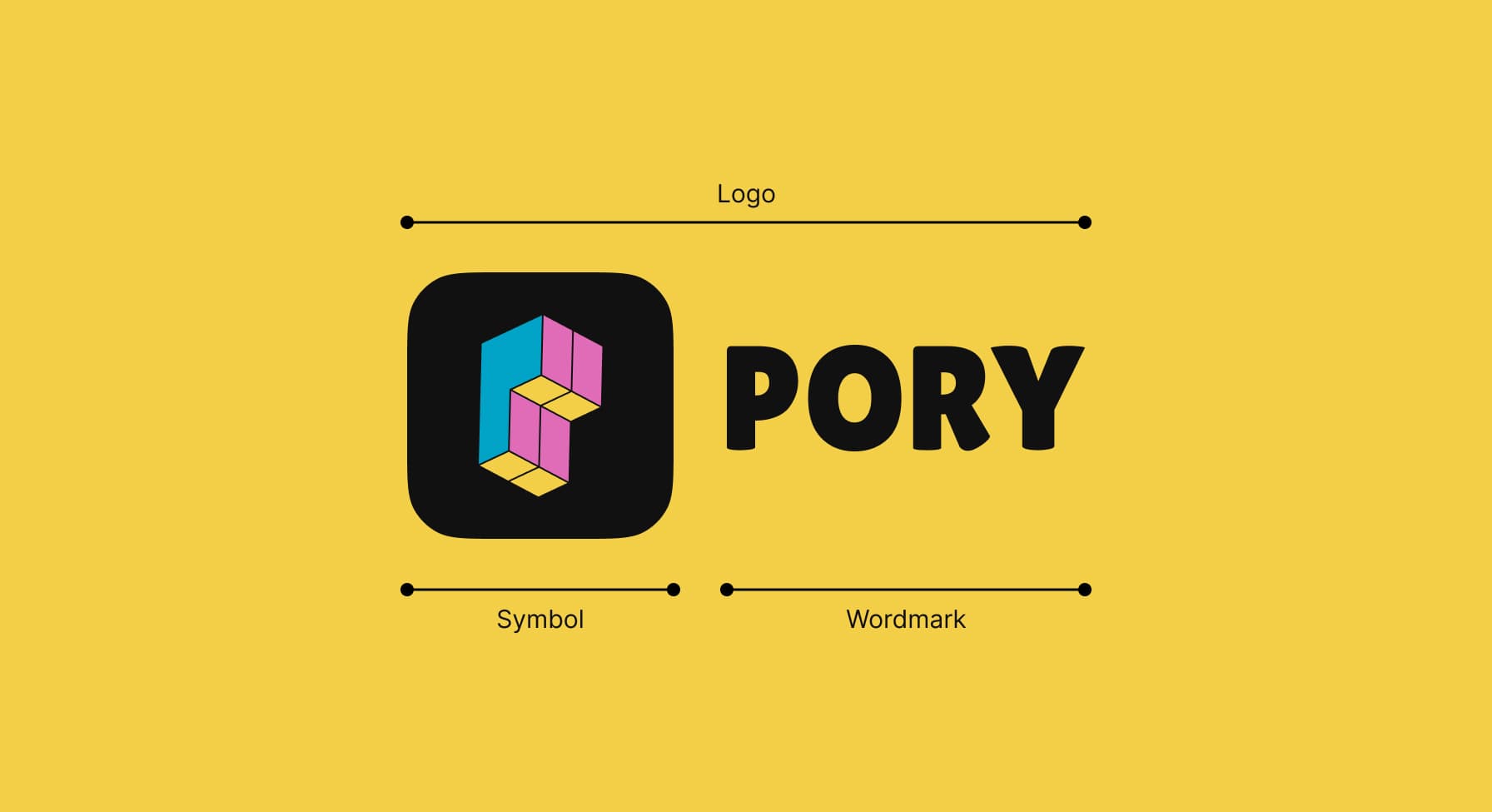
We have two elements within our logo lockup: the Pory symbol and wordmark. The symbol and the wordmark can each be used on their own, depending on the application.
Logo Spacing
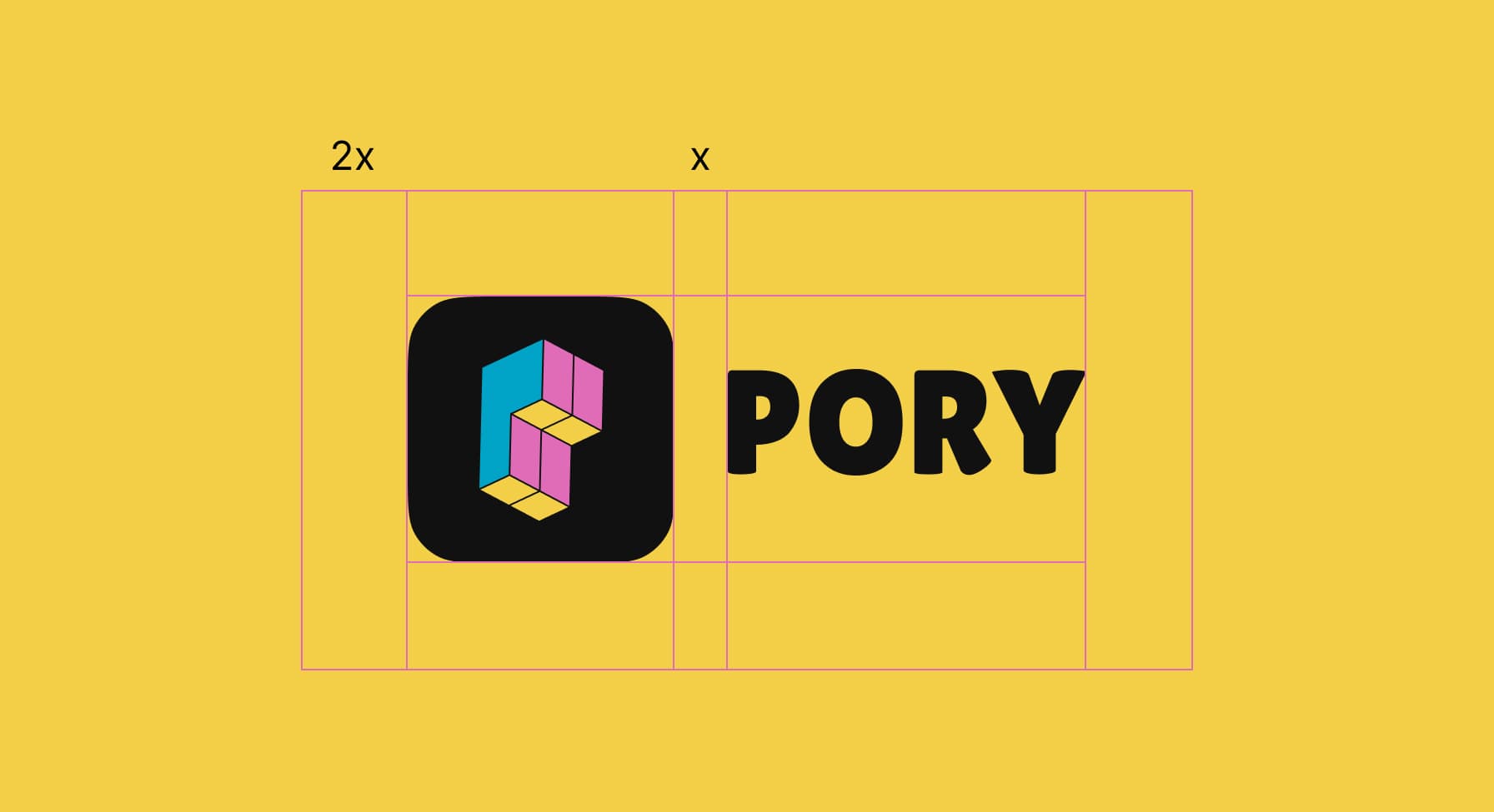
Remember to give some breathing room to the Pory logo. Start with the space between the symbol and wordmark (64px), then duplicate that distance by two (128px) — that's the minimum space that should exist between the logo and other elements.
Logo Scale
By establishing a minimum size, we ensure that the impact and legibility of the logo is not compromised in application. The Pory logo should never be reproduced smaller than 60px.

Logo Symbol
The symbol can stand alone from the logo and be used when we need to represent our identity in tight spaces — icons, social media avatars, and keynote slides.
Application Examples
The Pory wordmark is black, and the symbol looks best on its original black background. Here are some examples of how the Pory logo looks against its core palette.