Brand Guidelines
Logo
Our logo is the keystone of Pory's brand identity. Just like how you would create digital products on our platform using drag and drop blocks, we applied the same concept to create the letter P. This makes our logo instantly recognisable, and easier to associate with our brand and mission.
Colors
Our core brand palette is playful and vibrant, with an added jolt of creativity. We want to create an unmistakable, identifiable and ownable signature for brand recognition.
Aa
Primary
#805AD5
Aa
Yellow
#F3CE49
Aa
Pink
#D53F8C
Aa
White
#FFFFFF
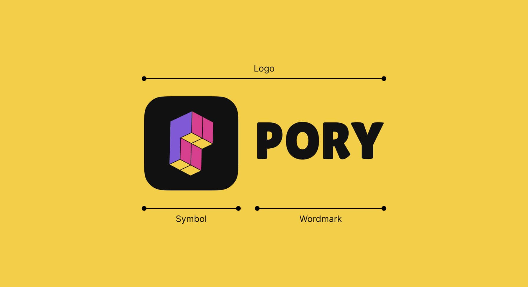
Logo Lockup
We have two elements within our logo lockup: The Pory symbol and wordmark. The symbol and wordmark can be used on its own depending on the application.
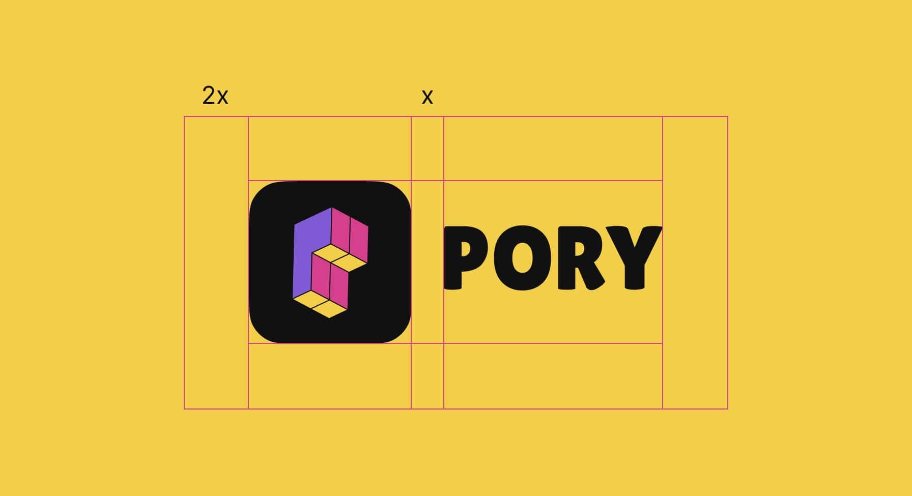
Logo Spacing
Remember to give some breathing room to the Pory logo! To do it correctly, be sure to:
1. Start with the space between our symbol and wordmark (64px).
2. Then duplicate that distance by two (128px). This is the minimum amount of space that should exist between the logo and other elements.
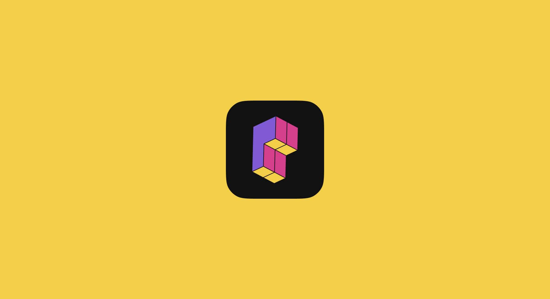
Logo Scale
By establishing a minimum size, we ensure that the impact and legibility of the logo is not compromised in application. The Pory Logo should never be reproduced smaller than 60px.

Logo Symbol
The symbol can stand alone from the logo and be used when we need to represent our identity in tight spaces. For example icons, social media avatars, and keynote slides.
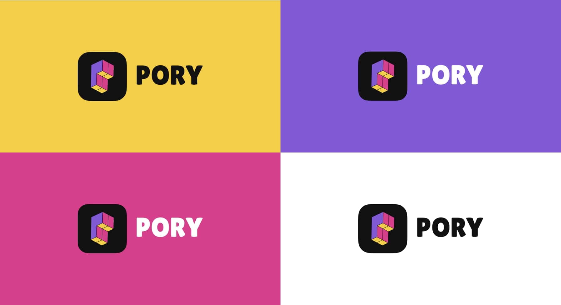
Application Examples
The Pory wordmark comes in both black and white, but the symbol looks best in its original black background. Here are some examples of how the Pory logo looks against its core palette of yellow, purple and pink.